Deconstruction and registration
My recent projects have a theme: let's take something apart, then put it back together again in a different way.
First, weaving. I attended Lisa Hill's deflected doubleweave class in May and got to see a few of her metaweaves. That sparked an idea. What if I wove a cloth and painted horizontal stripes on one section and vertical stripes on another. And then un-wove the cloth and re-wove it, swapping the wefts and weaving the two paintings together. What would it look like? And more importantly, how could I keep all the threads in order and registered throughout the process? I love a good puzzle.
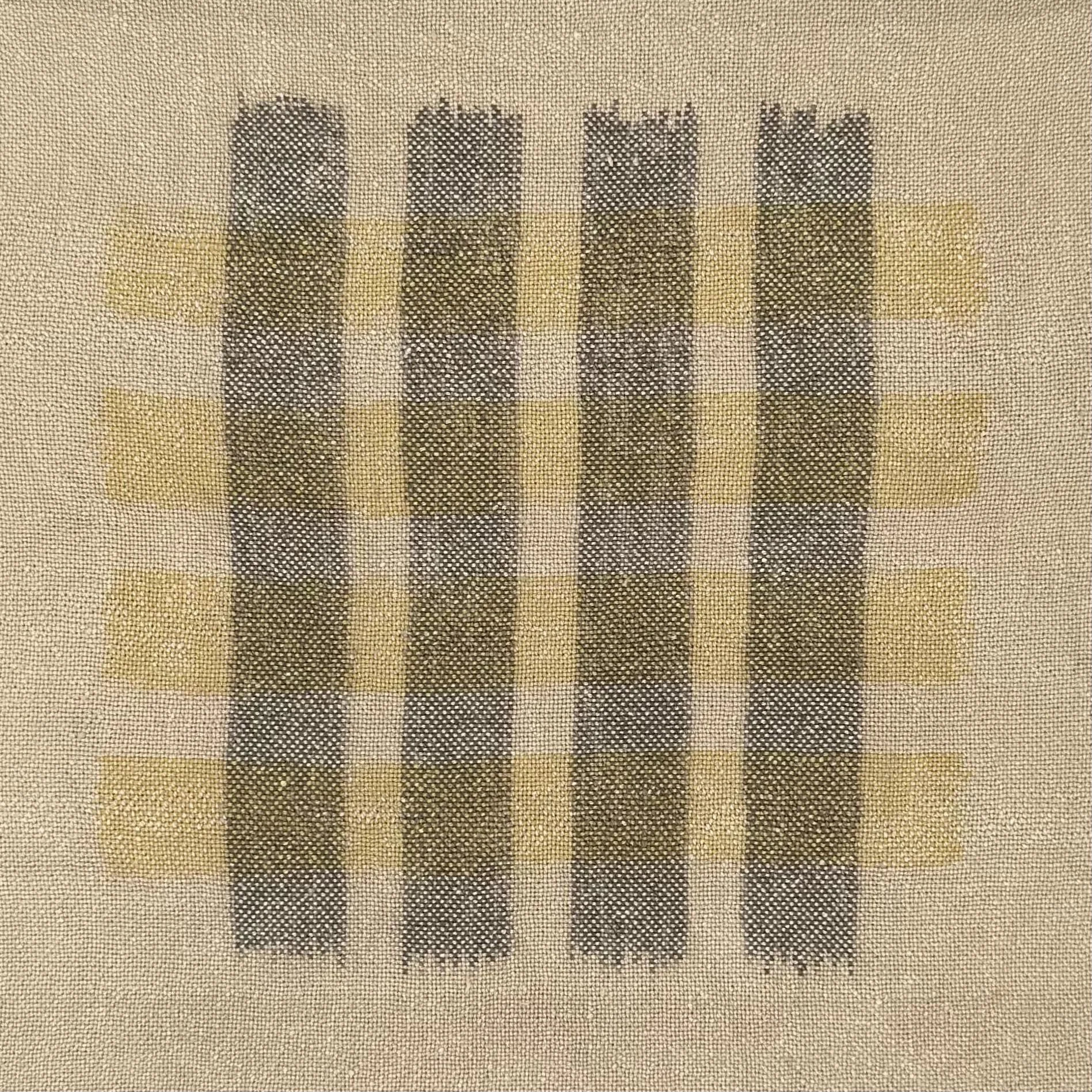
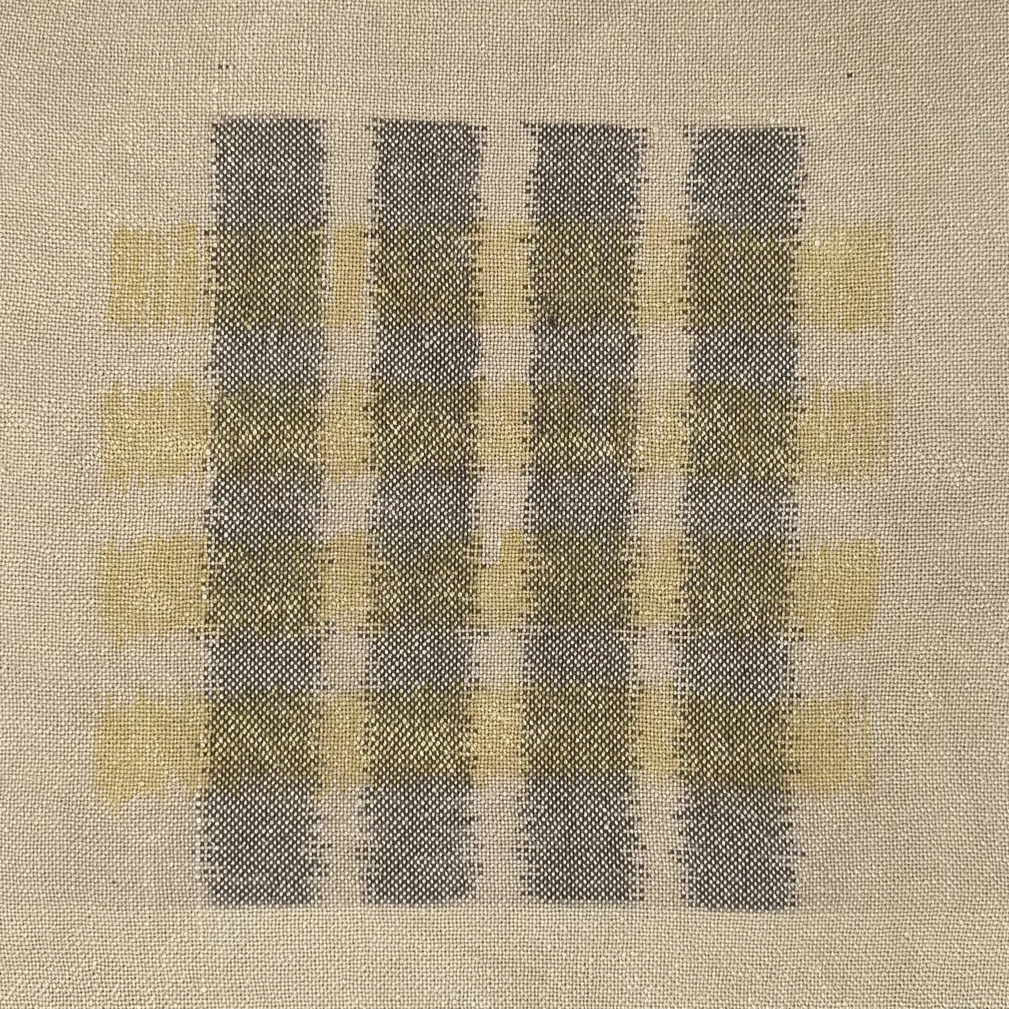
I wove a cloth, removed it from the loom, painted my stripes in mordant paste, and immersion dyed the cloth in pomegranate. The dye reacted differently to each mordant, creating 2 colors.
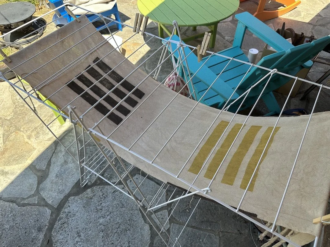
Then, I put this fellow back on my loom, trying to maintain registration and even tension. And cursing the process! Lots of trial and error, lots and lots of time. I understood in a deep way why people don't do this.
Once back on the loom, I un-wove the weft. A ski shuttle worked wonders. That was pretty fun.

And finally, I re-wove the cloth with swapped wefts. So fast!
By the end of the process, I had changed my mind. I'll probably try this again – with many adjustments in the re-warping process.
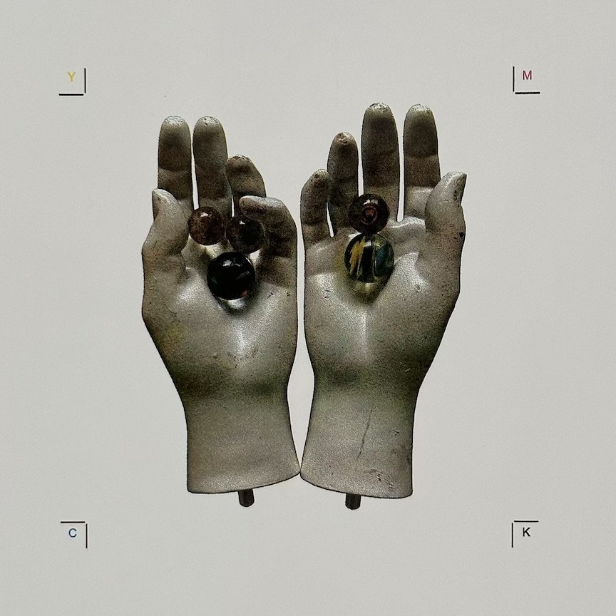
Next, printing. I spent the past weekend at SFCB with the phenomenal Rebecca Chamlee of Pie in the Sky Press. I enrolled in her photorealistic letterpress course where she taught her process of converting images into 4-color prints. So so good. If you have the opportunity to take a class with Rebecca, I highly recommend it!!
This project has been in work in progress. Last month, we met virtually to learn how to create images for the plates. My first polymers! Lots of time in the Adobe suite.

In person, we learned how to precisely register the 4 plates. I printed 2 images, each in 2 colorways (standard CMYK and fluorescent). That translated to 8 press cleanings in one weekend. 😓
My images materialized layer by layer, each time I ran the paper through the press. I honestly didn’t know what they were going to look like — nor did I believe it would work! — until I added the final layer. And it was shocking how different the two colorways looked. Below are my images in standard CMYK.
For my first image, I chose a photo of mannequin hands holding marbles that I made. This one was fun because there was so much white in the original image. How could I pull out more color?


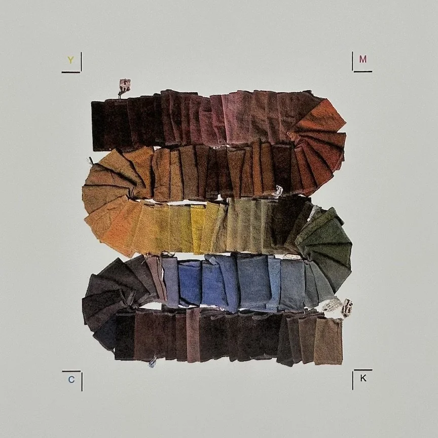
For my second image, I used a photo of my naturally dyed fabric samples. This image raised the opposite question: what would a rainbow of colors look like?


I'll end with quick dye garden update – so many blooms!

Year of Stories recent read: Meander, Spiral, Explode: Design and Pattern in Narrative by Jane Alison